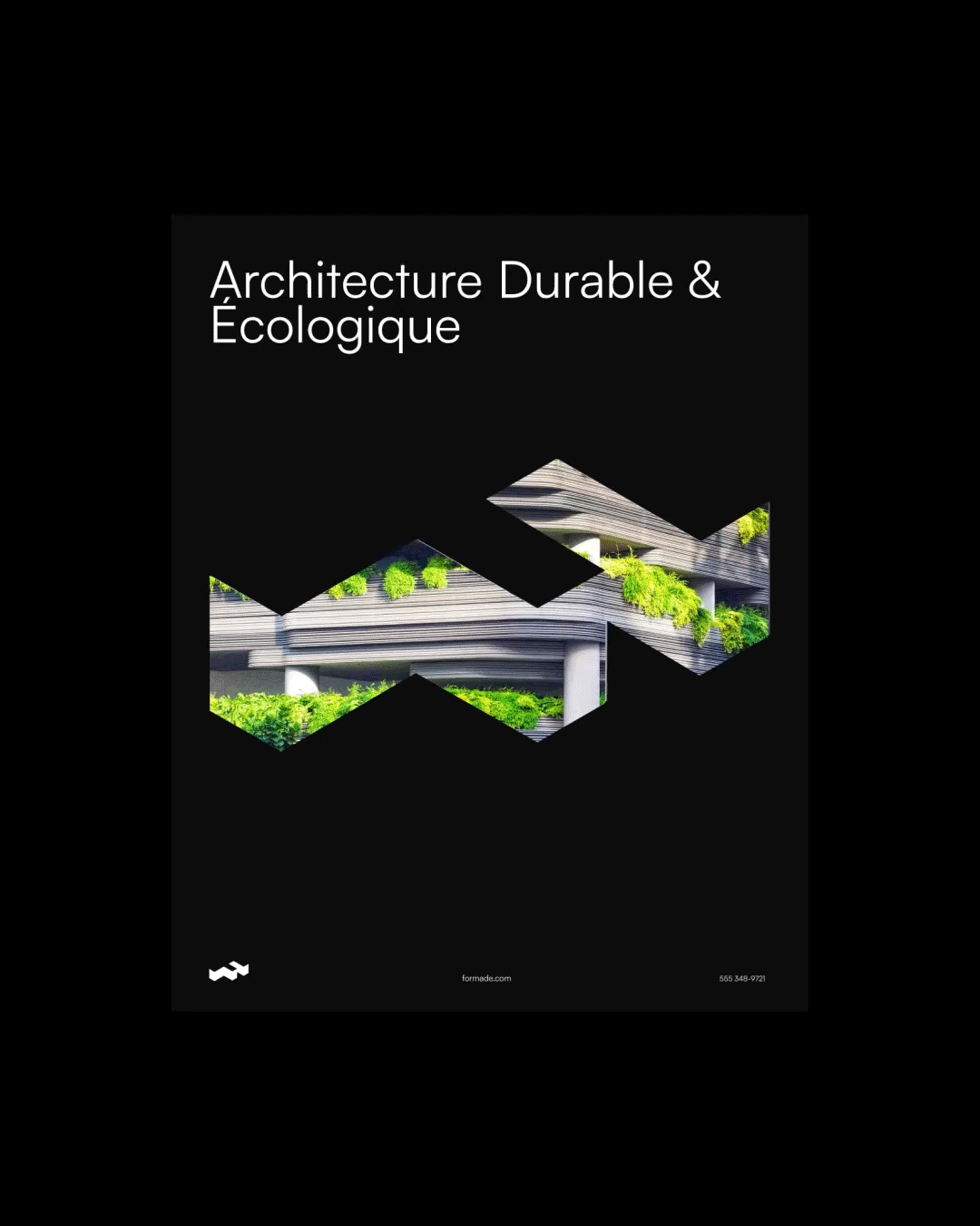
(FR) Formade, compagnie d’architecture évoluant dans divers milieux – résidences, bureaux et espaces publics – affirme son identité à travers une image à la fois minimaliste, épurée et audacieuse.
Cette signature visuelle est le fruit d’une collaboration à deux en tant que graphistes, avec pour objectif de créer une identité forte et cohérente. L’icône conçue s’inspire de l’architecture moderne et intègre subtilement la lettre F de Formade, renforçant ainsi l’empreinte visuelle de la marque.
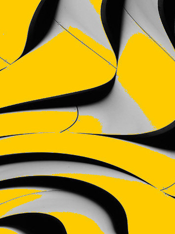
La palette de couleurs a été soigneusement sélectionnée pour refléter l’univers architectural de l’entreprise. Sobres et en harmonie avec les matériaux contemporains, ces teintes sont dynamisées par une touche de orange, symbole d’audace et d’innovation.
Merci d’avoir pris le temps de me lire, j’espère que vous aimerez les visuels ! 😊
-
(EN) Formade, an architecture firm operating in various fields—residential, office, and public spaces—asserts its identity through a visual language that is both minimalist, refined, and bold.
This visual signature is the result of a collaboration between two graphic designers, with the goal of creating a strong and cohesive identity. The icon draws inspiration from modern architecture while subtly incorporating the letter F from Formade, further reinforcing the brand’s identity.
The color palette was carefully selected to reflect the company’s architectural universe. Subtle and in harmony with contemporary materials, these tones are enhanced by a touch of orange, symbolizing boldness and innovation.
Thank you for taking the time to read this—I hope you’ll enjoy the visuals! 😊