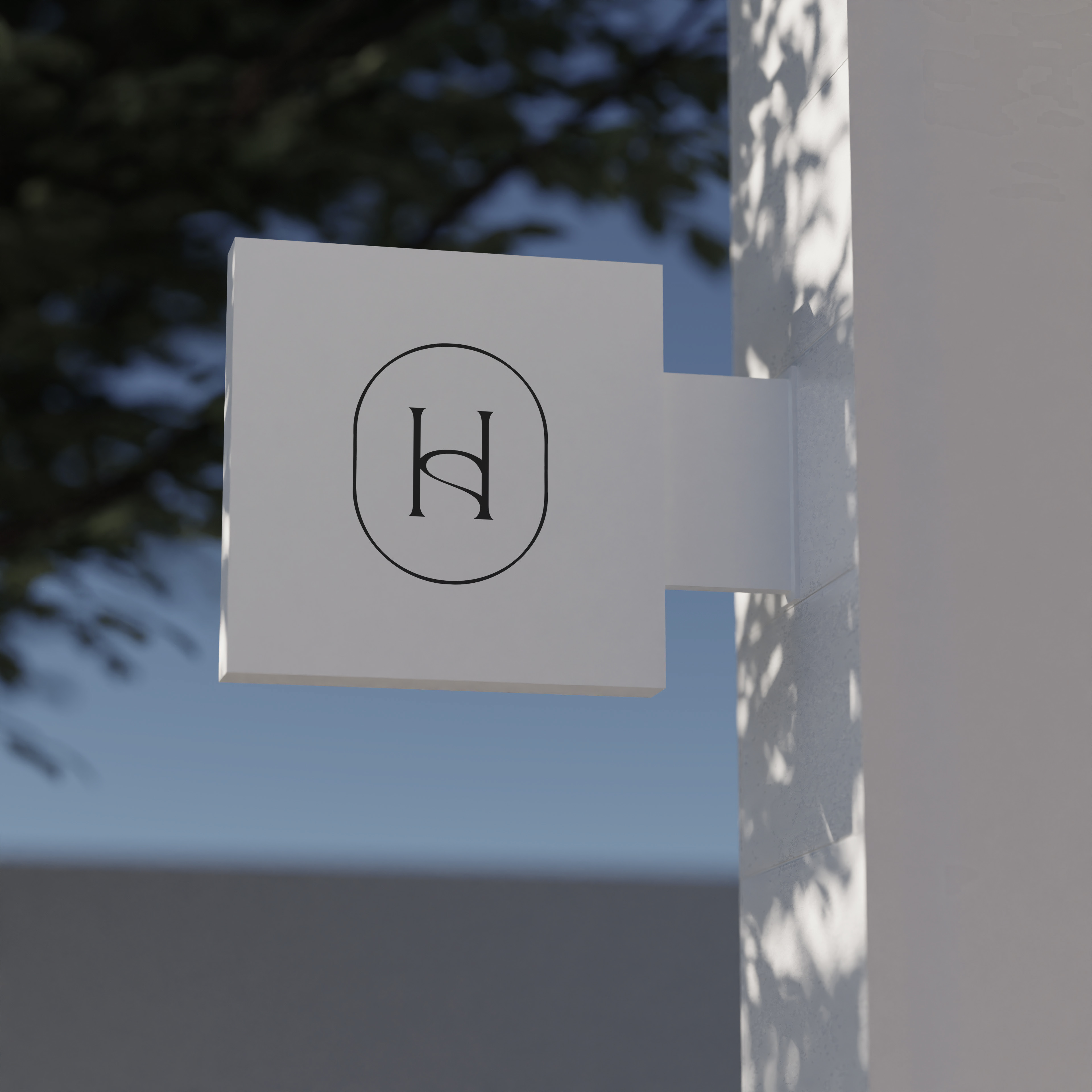
(FR) En début d'année 2024, l'entrepreneuse Shanie Horth m'a contacté pour concevoir sa première image de marque. Elle souhaitait un design professionnel et minimaliste, intégrant un monogramme.
L'utilisation des lettres S et H permet de réduire le logo ou de retirer la partie inférieure tout en conservant une identité reconnaissable. Cela rend le logo très polyvalent, facilitant son intégration sur divers éléments promotionnels. La forme circulaire évoque un espace, tandis que le positionnement des lettres à l'intérieur fait référence aux plans de design intérieur. La courbe du S et la délimitation du H rappellent les tracés utilisés pour représenter les entrées dans les pièces dans les croquis de design intérieur.
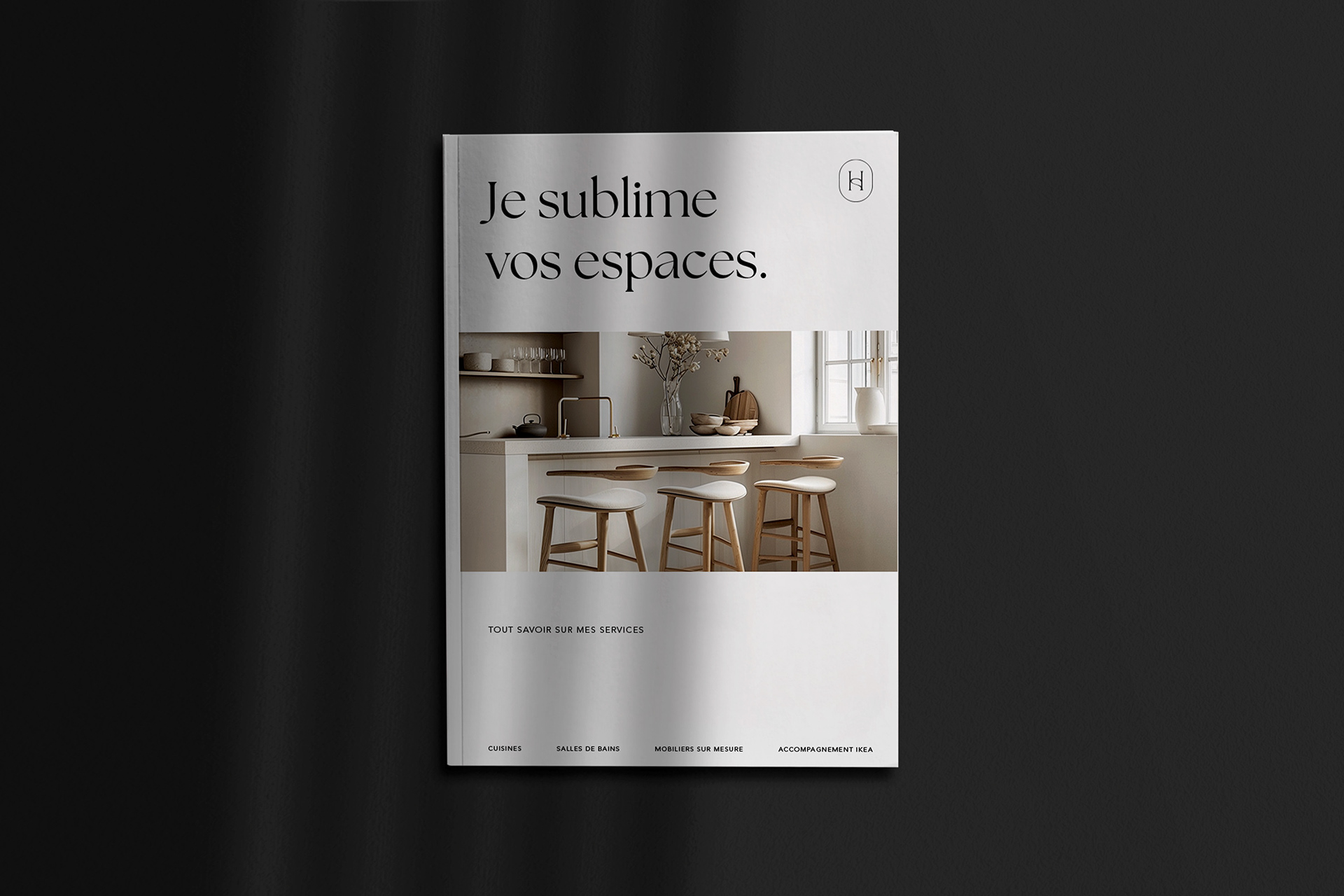
Les typographies choisies sont The Seasons et Avenir. Leur différence crée un contraste efficace lorsqu'il s'agit de distinguer le contenu textuel dans les annonces ou autres visuels connexes. Les empattements de la police The Seasons évoquent les courbes des meubles, tandis que l'aspect linéaire d'Avenir s'harmonise avec les lignes des plans de design.
Les couleurs sélectionnées sont simples : un blanc cassé et un noir délavé, qui apportent un aspect professionnel et luxueux.
-
(EN) At the beginning of 2024, entrepreneur Shannie Horth reached out to me to design her first brand identity. She wanted a professional and minimalist design that included a monogram.
The use of the letters S and H allows the logo to be reduced or the bottom part to be removed while still maintaining a recognizable identity. This makes the logo highly versatile, allowing it to be applied across various promotional materials. The circular shape evokes a sense of space, and the placement of the letters within this space nods to interior design plans. The curve of the S and the outline of the H are reminiscent of the lines used to represent doorways in interior design sketches.
The chosen typefaces are The Seasons and Avenir. Their contrast effectively separates textual content in advertisements and other related visuals. The serifs of The Seasons evoke the curves of furniture, while Avenir’s linear aspect aligns with the straight lines of design plans.
The selected colors are simple: an off-white and a faded black, creating a professional and luxurious appearance.